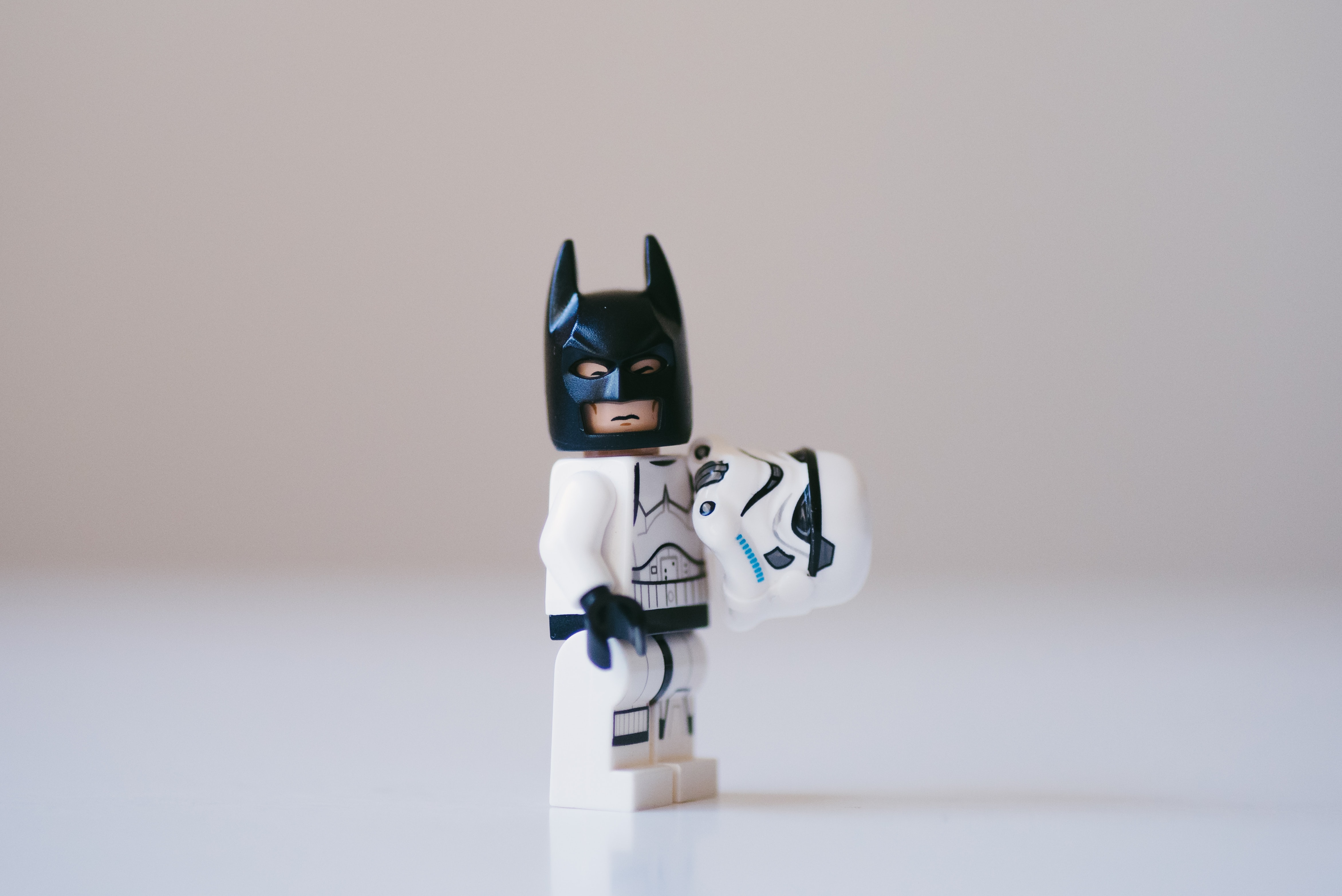
 Darkness and light in one picture, wow it's symbolic and stuff
Chances are, the words you are reading right now are white, and the background behind them is black.
It’s not like you don’t have a choice in the matter. There are all manner of tools that allow you to view webpages in dark mode as a default (like this one). If you are reading this article on my website, the sun/moon icon up in the top navigation bar allows you to toggle between light and dark mode with a single click. You probably just switched over to light mode out of curiosity, and then immediately switched it back to dark mode.
How am I doing so far? Am I way off base? Or am I so uncannily on point that you’re nervously glancing over your shoulder?
Survey says…
Predicting that you prefer dark mode over light mode is hardly much of a party trick, although I’m happy to take credit for any amazement you might have felt. An overwhelming majority of survey respondents expressed a preference for dark mode over light mode. Jimmy Westenberg with Android Authority reported that of the 2,514 Android Authority users who responded to a survey, over 80% use dark mode on their phones, apps, and wherever it is available. Developer Thomas Steiner conducted an informal survey of contrast polarity preference through Twitter, and the results are very similar to the Android Authority poll referenced above.
According to these results and others, the consensus seems to be a preference for dark mode, although one could argue that respondents of an internet survey tend to skew younger, wealthier, and more educated than a general sample of the population.
 Dark side rules, light side drools.
So dark mode wins, right?
Not so fast. One of the oft-cited reasons for preferring dark mode over light mode is that dark mode is easier on your eyes. However, even a cursory Google search should be enough to cast doubt on this assertion. Everyone is entitled to their opinion, but UX/UI designers know better than to base their designs on what users say. I think Jakob Nielsen said it best when he opined that good user design is in no way predicated on what users say – observing what they do is much more reliable and accurate.
As someone who spends a majority of my working hours in front of a computer screen (not to mention a fair amount of leisure time in front of other screens), the health and wellness aspect of this issue of screen contrast polarity is of particular interest to me. Although I have recently found dark themes to be my aesthetic preference, my even more recent realization that dark mode provides nearly no research-backed benefit to the reading comfort and eye health of average users was surprising to me, and provided the motivation to write this article.
 I see the light...
The case for light mode
Opinions aside, the majority of actual evidence-based, rigorous research seems to point to light mode being more advantageous for both eye health and legibility. Researchers with the Journal of the Human Factors and Ergonomics Society published a study in 2013 that found that use of positive polarity (light mode) led to an improved perception of detail. Another study in 2017 found that readers reading with positive polarity could read accurately with greater speed and ease than they could with negative polarity (dark mode). Interestingly, the same study found that these results were even more pronounced under dark ambient illumination, meaning that reading dark mode legibly in low-light situations is even harder than in high-light situations.
Raluca Budiu wrote a thorough summary of research findings on this issue. The results seem to indicate light mode leading to superior results in tasks across the board, both for visual acuity and proofreading. However, her summary did contain some points in favor of dark that are worth considering as well.

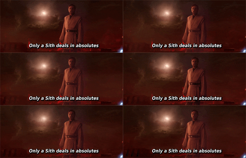
Few things in life are absolute
Although Budiu’s summary indicates that light mode wins across the board in terms of legibility and efficiency in reading, and that contrast polarity had no significant impact on eye fatigue, there are still [a couple] reasons to consider sticking with dark mode. A 2018 study found that the way that the eye behaves when reading positive polarity may lead to myopia (nearsightedness) in the long term. The suggested remedy to offset this effect is, naturally, to use dark mode.
As far as I can tell, this study is the only published academic study that supports this conclusion. One of the core tenets of proper research is replicability, so although I cannot dismiss this study’s findings, more research supporting this conclusion is needed to affirm the findings (in my opinion).
Conclusion
Although I will keep checking the research to see if any more published studies corroborate the 2018 myopia study’s findings, I feel that the great majority of research into the effect of contrast polarity on eyes indicates that light mode is the way to go. So, although dark themes are cool and trendy, I’m switching back to light all the way (I’m typing this article in a light-theme VSC. It is so weird…).
What will you do? Join the dark side or turn towards the light? Whatever you choose, make sure you understand the risks and benefits of your options.
 Wait what
Attributions:
- Baby Yoda at window image by Victor Serban (UnSplash)
- Stormtrooper Batman image by Daniel Cheung (UnSplash)
- Red lightsaber in cave image by Cade Roberts (UnSplash)
- Darth Vader image by Tommy van Kessel (UnSplash)
- Obi Wan gif linked from Giphy